🌚🌝
I came across the idea of implementing night mode using mix-blend-mode: difference when I was preparing for my talk This World Mixed and Blended (update Jan 7 2020: I lost the domain so you might not be able to visit this site, sorry about that). The original idea was only meant for a showcase and the browser support is currently limited.
Still, I implemented it to my dev blog and had a lot of fun. So this will be what this post is about. Meanwhile, as I thought more about it, it occurs to me now that this can be a legit preferred way night mode is to be done. And let me share a bit about the intuition behind that as well.
Please note that this is not a standard way of implementing dark mode. To see how people normally do it, you may want to see here for how Dan Abramov does it for Overreacted, or this post.
Understanding Blending Mode Difference
mix-blend-mode: difference is one of the blending modes CSS supports, as specified in Compositing and Blending Level 1. Blending modes, in turn, specify how colors mix when graphics are stacked together. The graphics do not limit to images. Any rendered graphics, content of divs, texts, emojis 🌚🌝, svgs, may participate in the blending.
I'd like to think of that as the process where browsers check with us whenever they are about to paint a new element: “Hey, it seems that this next pixel I'm painting is red, but currently I am seeing a blue on the ground, by any chance you want me to combine those colors together, and if so, how?”
Blending modes allow us to create some very interesting effects such as overlaying texts on an image while revealing the texture of the graphics directly in a browser:
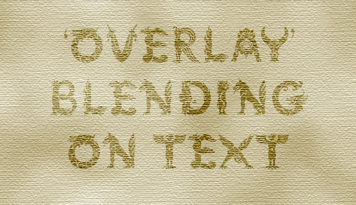
Example of blending mode from Compositing and Blending Level 1
Definition
mix-blend-mode: difference, in particular, is one of the blending modes that is defined as taking the absolute value of the difference between the two colors:
difference(A, B) = |A - B|This is an abstraction of the actual computation, where for each color we meant three numbers representing the R, G, and B channels, respectively. As an example,
difference(
    rgb(255, 255, 255),
    rgb(0, 100, 200)
) = rgb(255, 155, 55)
Meanwhile, taking the absolute value makes the operation commutative, meaning B(A, B) = B(B, A). In another words, it doesn't matter which graphic is laid on top of the other, the result is going to be the same.
Intuition
What exactly is the blending mode difference doing? The definition seems straightforward. However, our minds may not be very good at perceiving what will happen to the resultant color before actually seeing them. To name an example, difference(white, red) is essentially deducing the complement color of red, which is teal. But how can you “see” it until you actually saw it?
The following pen is created by blending intersecting stripes of whites and reds only.
Perhaps exactly because its hardly perceivable effects, we can use mix-blend-mode: difference to create some contrasting visuals to spark surprises in UI, like this one by Sven Wolfermann:
This was the design that inspired me to think about creating dark mode using difference.
Implementing dark mode using Difference
How does it work?
The idea is simple: When night mode is turned on, cover your site with a full-screen div with background: white and mix-blend-mode: difference, and save yourself the trouble of defining all the colors again 😉
.dark-mode-screen {
  width: 100vw;
  height: 100vh;
  position: fixed;
  top: 0;
  left: 0;
  background: white;
  mix-blend-mode: difference;
}
Why, though?
The thought process involves two of the mathematicians' favorite numbers, 0 and 1.
In unit space, 0 means nothing and 1 means everything.
In RGB colors, 0 means black and 1 (100% or 255) means white.
Now let's think about our blog site, and let's assume that currently we have a white background and a black foreground. If we take the difference of that page against white, what do we get?
- background: currently white, the difference between white and white is nothing, which means black
- foreground: currently black, which means nothing, the difference between white and nothing is white
Now we have a black background and a white foreground, and look what is that? A reversed (dark) theme :)
Furthermore, when taking the difference of the page with white, the contrast between the original background and foreground is automatically preserved. This does not only apply to blacks and whites. In fact, my code block with original theme Dracula picks up a nice sepia-styled hue when inverted.


Transition
Scaling a div
I put a toggle fixed to the lower bottom of the page. When the night mode is toggled on, I transform that toggle to scale up that covers the whole page. This effect is kind of showing off the original UX design.
Opacity
If you prefer a more subtle toggle, maybe tweaking opacity is a better choice and the blending mode will work just as nice. With an easing timing function on the transition, this is perhaps the transition UI shared by most websites and blogs implementing a night mode.

Isolate the elements that are not intended to blend
As mentioned earlier, mix-blend-mode will apply on any graphics. However, when implementing dark mode, some elements may not be intended to blend. Such examples include logos of specific colors, emojis, etc. To specify that, you can put isolation: isolate (reference) on those elements. Note that this will create a stacking context on the element that is isolated.
.twitter-logo,
.emoji {
  isolation: isolate; // twitter logo will not blend
}

// elements that create their a stacking context are automatically isolated
.footer {
  z-index: 1;
}
Pick a colored hue for your dark mode
As mentioned earlier, taking the difference between the page against white is like taking the complement color directly. You may not have to limit that choice of color to white. In fact, you can pick any color to take the difference with. For an effect of a darker theme where your site was initially on a light background, you may consider any color that is relatively light:

These are some of the technical details I've encountered. If you're trying this and encounter issues here and there, please feel free to let me know and I'd be glad if I can help.
To see this thing in code, check out this CodePen:
Limits
(apart from being geeky 😅)
- You don't have full range of colors. It saves you the trouble of specifying more colors, but you'd lose control over the dark colors — they'd be deduced from your light colors. Yet this may not be a limit but rather a design choice.
- Browser support of
mix-blend-modeis still not optimal, you're stuck with non-IE, relatively newer versions of browsers. - Performance can be a concern as well for its by-pixel and by-channel computation. Don't do crazy animations with it (yet).
Till next time 🤞
Blending modes were citizens from computer graphics. I remember first playing around with them in Photoshop years ago. Now that browsers are becoming more powerful and we are seeing complex graphical features native to browser rendering. This doesn't mean we should implement a full photoshop in browsers and nor should we limit our imaginations to just that. Browsers and web pages have their own contexts and goals, as well as a different set of limits. Maybe we should welcome them like new habitants and discover use cases native to this territory.
Once again, the inspiration credits to this CodePen, a cute animation that strikes an impression at first sight.
I hope this serves as a friendly discovery about blending modes, and I hope you had fun same as I do.