I was working on this Dribbble Design by Louie Mantia. At my first sight, all features of this design seemed fairly straightforward, except for the intersection curves near the handhelds.

I found my trick to intersect the divs. In a few words, I gave the blue region overflow: hidden, created an extra div that lives inside the blue, make it same size as the red region, and match the position with the exact offset. It made me smile and proud. CodePen
But I cannot stop but wonder: When the browser renders the second layer, whichever that is, it should already know about the first layer. Then, wouldn’t it be easy for the browsers to do some kind of calculation with the new layer it’s rendering next, and produce some kind of mixing effect?
A few searches landed me to mix-blend-mode specified in Composing and Blending Level 1. This set of specifications defines how shapes and images are combined into a single image.
Reading the specs
Composing and blending describes exactly how to produce the final graphics when they are stacked together. “Composing and blending” is one single step (not two steps). It happens as the final step, after, filtering, clipping, and masking.
Composing uses the Porter-Duff composing method, which, given two graphics — a source and a destination — specifies 12 different modes how they shall be combined.

The Porter-Duff Operators, image credits to http://ssp.impulsetrain.com/porterduff.html
Blending, then, lets you specify a function that calculates the final color in this process.
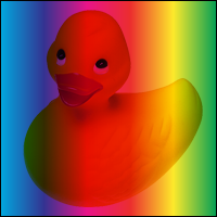
The specs does a really good job explaining the whole process, including what each of the blending modes feels intuitively and it gives you a graphical example with that yellow duck in the bathtubs blended with a rainbow. Even with my college math nearly all returned to my professors I was able to deduce some of its conclusion just by looking. I find this piece of specs way more reader-friendly than this elaborate description of stacking context lol.
It explains what “multiply” means in blending with an example:
The source color is multiplied by the destination color and replaces the destination. The resultant color is always at least as dark as either the source or destination color. Multiplying any color with black results in black. Multiplying any color with white preserves the original color.

Here is a pen that puts all the blending modes for select, and displays the visual effect on different input colors.
Limits
- It is subject to (rather poor) browser compatibility
- Resulting color is subject to limited functions with two color inputs
Composing and blending is really cool, but not without its limit. Back to the example I began with, the exact effect cannot be easily produced with mix-blend-mode, and do you see why?
The limit is, the resulting color must be the output of a blending function calculated by taking the source and the backdrop colors. If you want an arbitrary color that does not depend on those input colors, then you won’t get the color by simply picking a mix-blend-mode.
The Nintendo Switch design happened to have only used the concept of an intersection. The darker blue in the intersection, despite strikingly beautiful, is not achievable with any one of the blending modes.
- Performance
I have not found a way to benchmark the performance on this property. But I noticed with Chrome that it almost always flickers the two separate layers before blending, sometimes one-by-one. And with some more complex blending my laptop starts to roar.
What they are creating with mix-blend-mode
To learn about how designers and developers have already been using mix-blend-mode , I did a search in CodePen. And I found many beautiful designs which I’ll just put into a few categories for easier reference. But please don’t let them restrict your creativity.
- Image + single color text to create masking effect / knockout texts
Check out this one-liner way of image masking, duos, CodePen: Knockout Text:
CodePen: Knockout Text with CSS Blend Modes
- RGB with
mix-blend-mode: screenfor an illuminating feel
This next one that came up has a cuteness in its 蠢萌 *with those letters rolling around.* I cannot find a better term. Sorry non-Chinese speakers 😂
CodePen: Letter mix blend mode
Android Nougat update animation
- Using composition to create interesting UX that is otherwise complex to implement
Next, I find this interaction which, if without the knowledge of mix-blend-mode, would be a mystery of how to create. JavaScript?
CodePen: CSS mix-blend-mode - black/white text - with pseudo elements
- Typographic designs
This interesting design uses overlay to let the background hue over the text color.
I have created a CodePen Collection for some interesting design implementations I've seen along the way, cuz I want to be the Don Quijote for developers x designers :]